A small stylesheet that tidies the product pages. It changes no theme files, hides nothing, moves nothing, and can be taken out again by deleting it, saving and flushing the cache (steps below). Every picture below is the live Posh page with the stylesheet tried out in our own browser only. The real site has not been changed.
Use the buttons at the top to look at a different product or the phone size. The default is the Apex enclosure on a computer.
Before and after
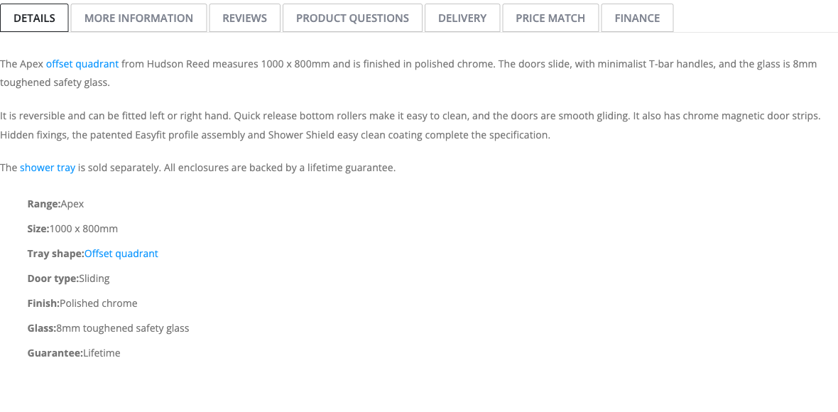
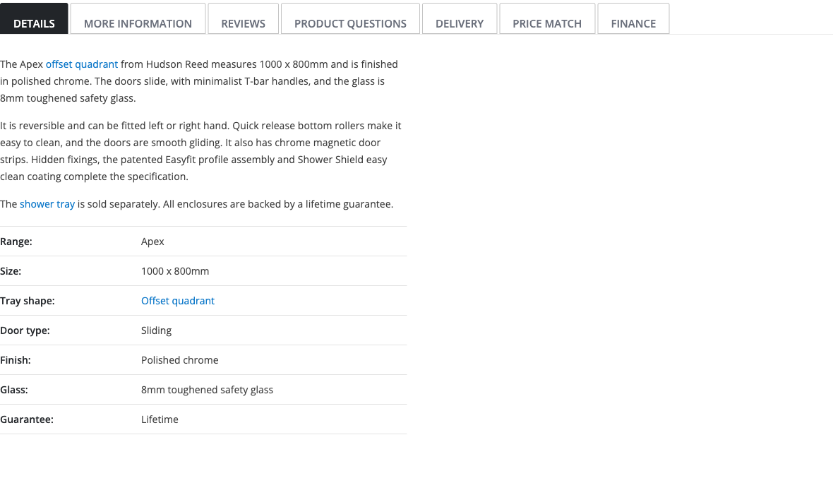
Details tab: feature list and description
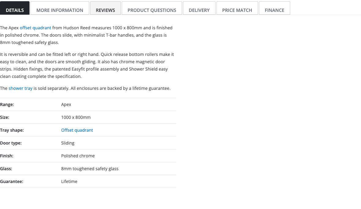
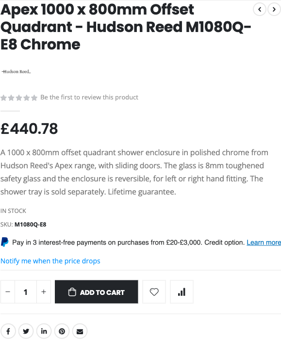
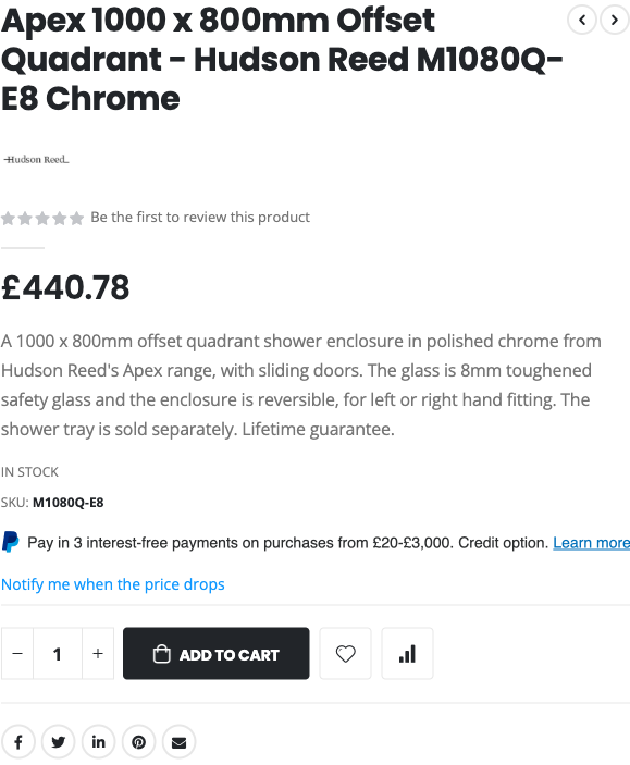
The feature list is now a tidy two column table (label on the left, value on the right) with light dividers, lined up with the paragraphs above it. The paragraphs are a comfortable reading width in a darker grey. On computers the tab row has a clearer active tab, a hover state, a visible keyboard outline and a tap area of at least 44px high. On phones the tabs stay exactly as they are now.
BeforeAfter
Hovering a tab (desktop only)
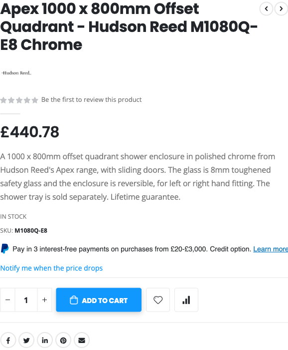
Buy box: Add to Cart
Add to Cart now responds when you hover or press it (it keeps Posh's blue hover colour and gains a soft shadow, plus a 1px press). Quantity box, wishlist and compare buttons share the same softly rounded corners. The "Be the first to review" link is darker grey, so it is easier to read.
Hovering Add to Cart (desktop only)
BeforeAfter
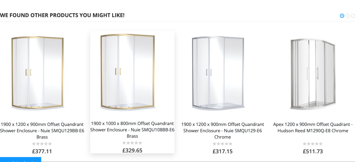
"We found other products you might like"
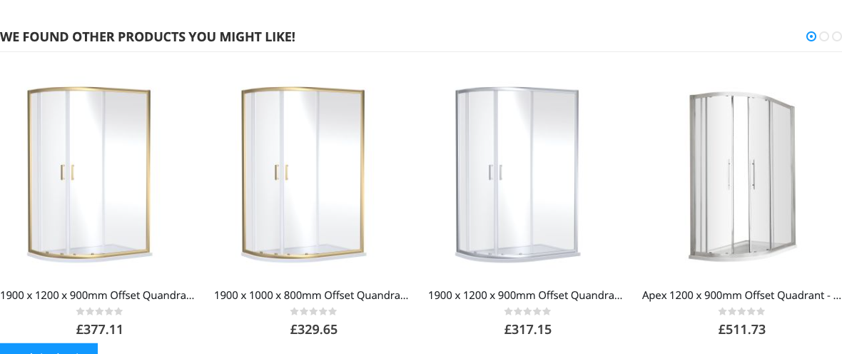
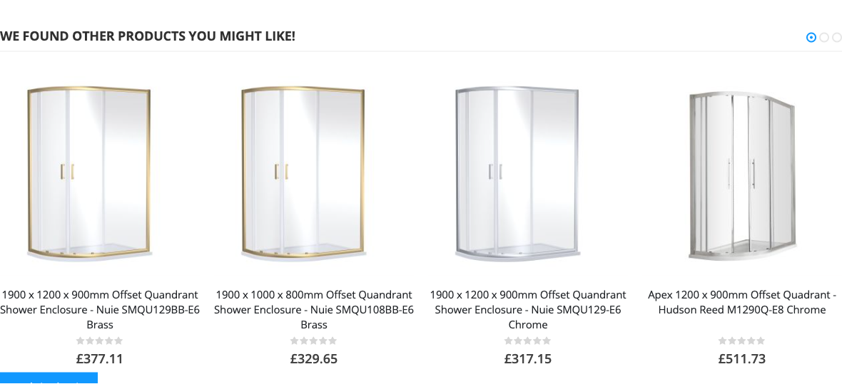
Product names now wrap onto up to three lines instead of stopping at three dots, so you can tell products apart. Cards lift slightly and the picture zooms a little when you hover.
BeforeAfter
Hovering a product card (desktop only)
Site-wide (optional)
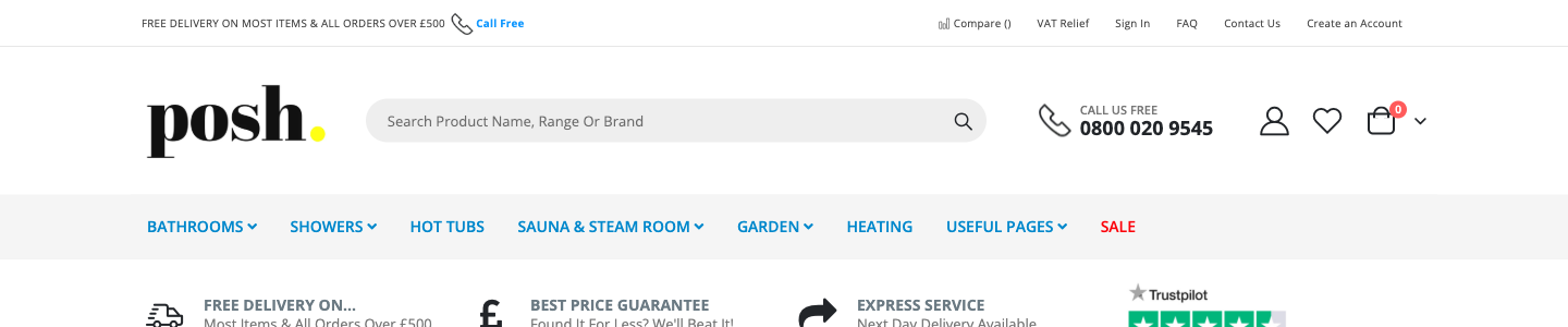
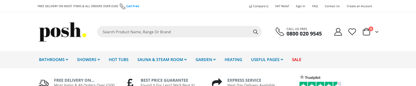
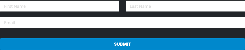
Menu, breadcrumbs and newsletter box
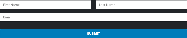
These are the second half of the stylesheet. They change colours on every page of the shop, not only product pages, so they are kept in a separate part you can delete if you would rather not touch them. The menu blue and SALE red get slightly deeper so they are easier to read on the grey bar. The newsletter Submit button gets slightly deeper blue and the field hints get darker.
BeforeAfter
BeforeAfter
Readability, measured
Text colour contrast
A ratio of 4.5 or more is the usual minimum for easy reading. These are the colours we measured on the live Apex page, before and after. Each fix is the smallest change that reaches 4.5.
Where
Before
Ratio
After
Ratio
Applies to
Main menu links (blue menu bar on screens 992px wide and up; hover colour, tablet and phone menus unchanged)
#0088cc on #f5f5f5
3.57
#0076b1
4.56
Site-wide
SALE in the menu bar (992px and up)
#fc0009 on #f5f5f5
3.75
#e00008
4.62
Site-wide
Breadcrumbs (Home > ...)
#8e8e8e on #ebebeb
2.75
#696969
4.61
Site-wide
Newsletter Submit button (white text)
white on #0088cc
3.89
white on #007cba
4.57
Site-wide
Newsletter field hints (First Name, Email)
#dddddd on white
1.36
#757575
4.61
Site-wide
"Be the first to review this product" link in the buy box
#999999 on white
2.85
#757575
4.61
Product pages
Same review link in the bar that appears when you scroll
#1198ff on white
3.02
#0d78c9
4.62
Product pages
Links inside the description
#1198ff on white
3.02
#0d78c9
4.62
Product pages
Short description, SKU label, stock text (barely visible change)
#777777 on white
4.48
#757575
4.61
Product pages
Description paragraphs and feature list
#777777 on white
4.48
#3d3d3d
10.86
Product pages
Tab names that are not selected (computers)
#818692 on white
3.65
#6b707c
4.96
Product pages
How to add it
In Magento Admin go to Content > Design > Configuration.
Find the store view in the list and click Edit in its row.
Open Other Settings > HTML Head.
In Scripts and Style Sheets, type <style>, paste the whole of posh-polish.css, then type </style>:
<style>
  ...paste posh-polish.css here...
</style>
Add it below anything already in the box. Do not delete what is there. If your store view already has its own entry in this box, edit that one: the store view's entry overrides the website or default one.
Click Save Configuration, then flush the cache (System > Cache Management > Flush Magento Cache).
To remove it: delete what you pasted, save, and flush the cache again. The shop goes straight back to how it is now.
Adobe's own help pages give the path above (Content > Design > Configuration, then Edit on the store view, then HTML Head). Adobe's pages do not mention the cache step, which is standard Magento practice. If you only want product pages changed, leave out the section marked "PART 2: SITE-WIDE".
Needs your developer, not CSS
Stylesheets can only change how things look. These need a developer to change what is on the page:
"inc. VAT" and the delivery cost next to the price.
Trust badges beside Add to Cart. "FREE DELIVERY ON MOST ITEMS & ALL ORDERS OVER £500" sits in the strip at the very top of the page, a long way from a £440 product.
Make "shower tray sold separately" stand out next to the button, on the products where that applies. It is in the text already, but it is easy to miss.
Hide "Be the first to review" on products with no reviews.
Visible labels on the newsletter fields. The page code has labels, but they are empty, so the only hint is the grey text (First Name, Last Name, Email) that disappears as soon as someone starts typing.